<ul class="fa-ul" style="font-size:2em; color:#000;">
<li><i class="fa-li fas fa-cubes"></i>User Research discovery, contextual research report, Documentation, Standards and Manuals</li>
<li><i class="fa-li fas fa-pencil-ruler"></i>Usability Testing: Navigation, Information Architecture, Treejack, A/B, Heuristic Evaluation, Competitive Analysis, User Journey, Persona development</li>
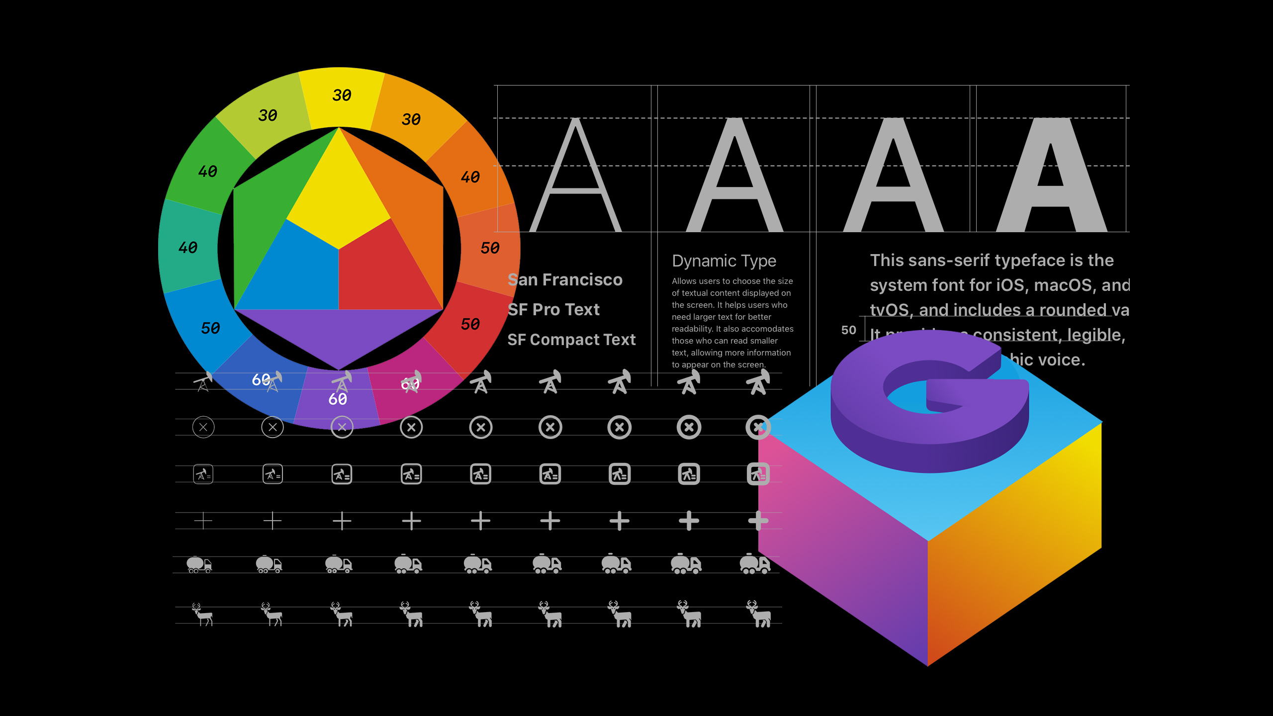
<li><i class="fa-li fas fa-pencil-ruler"></i>Design Systems: Human Interface Guidelines, Google Material</li>
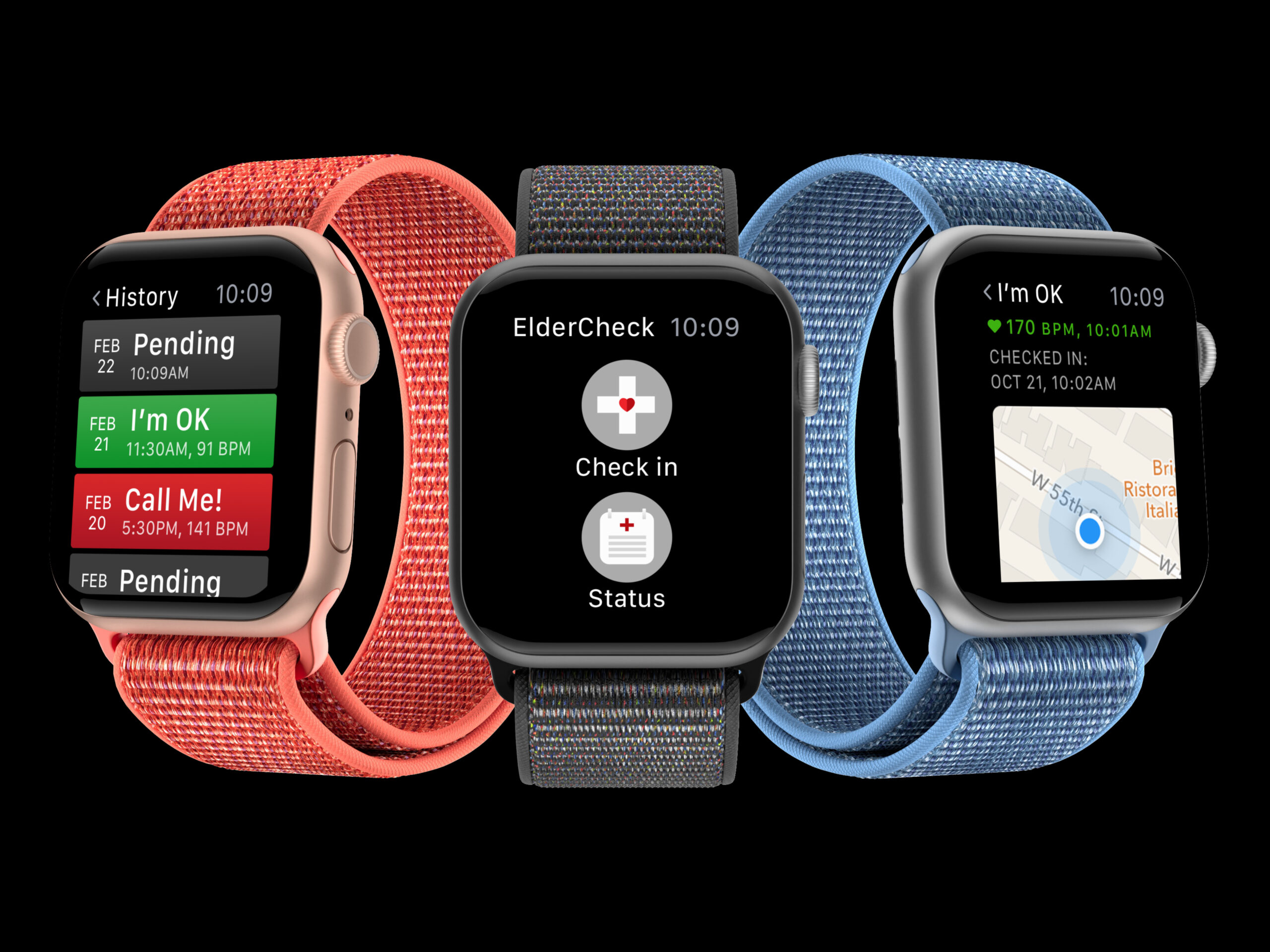
<li><i class="fa-li fab fa-apple"></i>Platforms: iOS Native ecosystem, iPhone iPadOS, TVOS, watchOS, web</li>
<li><i class="fa-li fab fa-sketch"></i>Sketch, Figma, Abstract, Principle</li>
<li><i class="fa-li fab fa-adobe"></i>Adobe CC - XD, PS, AI, Premier</li>
</ul>
Semplice Sizes
Total Width 1170
1 Col = 70px
2 Col = 170px
3 Col = 270px
4 Col = 370px
5 Col = 470px
6 Col = 570px
7 Col = 670px
8 Col = 770px
9 Col = 870px
10 Col = 970px
11 Col = 1070px
12 Col = 1170px
Cover Sliders
1920 x 1080 or 2560 x 1440
Fluid portfolio grids
When it comes to fluid grids, the approach is similar to the cover slider: You need to find a good balance between quality and size. If you want to be sure, you can calculate the optimized values yourself. So for example, if you want to deliver sharp and crisp images to a 1920 x 1080 screen and you are using a fluid grid, you’ll need to divide the width by 12.
Example:
1920/12=160px per Column
3Col =160px*3=480px
CSS
underline-links
https://catlo.design/prototype/#/
→
©—2025 Cat Lo. All Rights Reserved ↗ Privacy Policy
