Why do we call initial designs the “Look and Feel?”
- How do we want clients to give us feedback on initial design concepts?
- How do we narrow down designs more effectively from the start?
- Clients should focus on the feeling, not the look.
What’s a feeling? A feeling is when you are confident in making the best decision by weighing what users care about and the varying points of view involved. The feeling presents itself as a form of balance and harmony. What does this design convey? Does it serve the purpose of the story I want to tell? Is the messaging clear and defined? Is it confusing?
When you serve clients, you defer all creative decisions to the client. You anticipate what they will say before you present and you quietly root for the work you want them to choose.
You may have heard this comment, “Do not include a design that you hate because they will choose it!” or “The client just went through twenty iterations and they went back to the first one they saw.”
Why would a client deliberately choose what seems to be the most boisterously offensively ugly design of them all? Is it because they simply aren’t trained with a design eye and can’t distinguish which design is above the others? How can we change the process of developing feeling towards a design?
Design has taken a major shift in the past few years, increased attention is paid to mobile responsive sites. The industry shifted from creating table-based layouts to CSS responsive fluid designs. Creating a site that’s table-based means you have to create a design in 1200, 768, 480, and 320. Smaller devices slowly become out of commission and larger density resolution devices become a natural reach in our lives.
All this is to say that design, annotation, and production graphics has to be made to fit these sizes for the best optimal experience.
Is there a better way to all of this?
Let’s take a look at the traditional design process:
-
Initial design work starts with understanding your client’s requirements and desires.
-
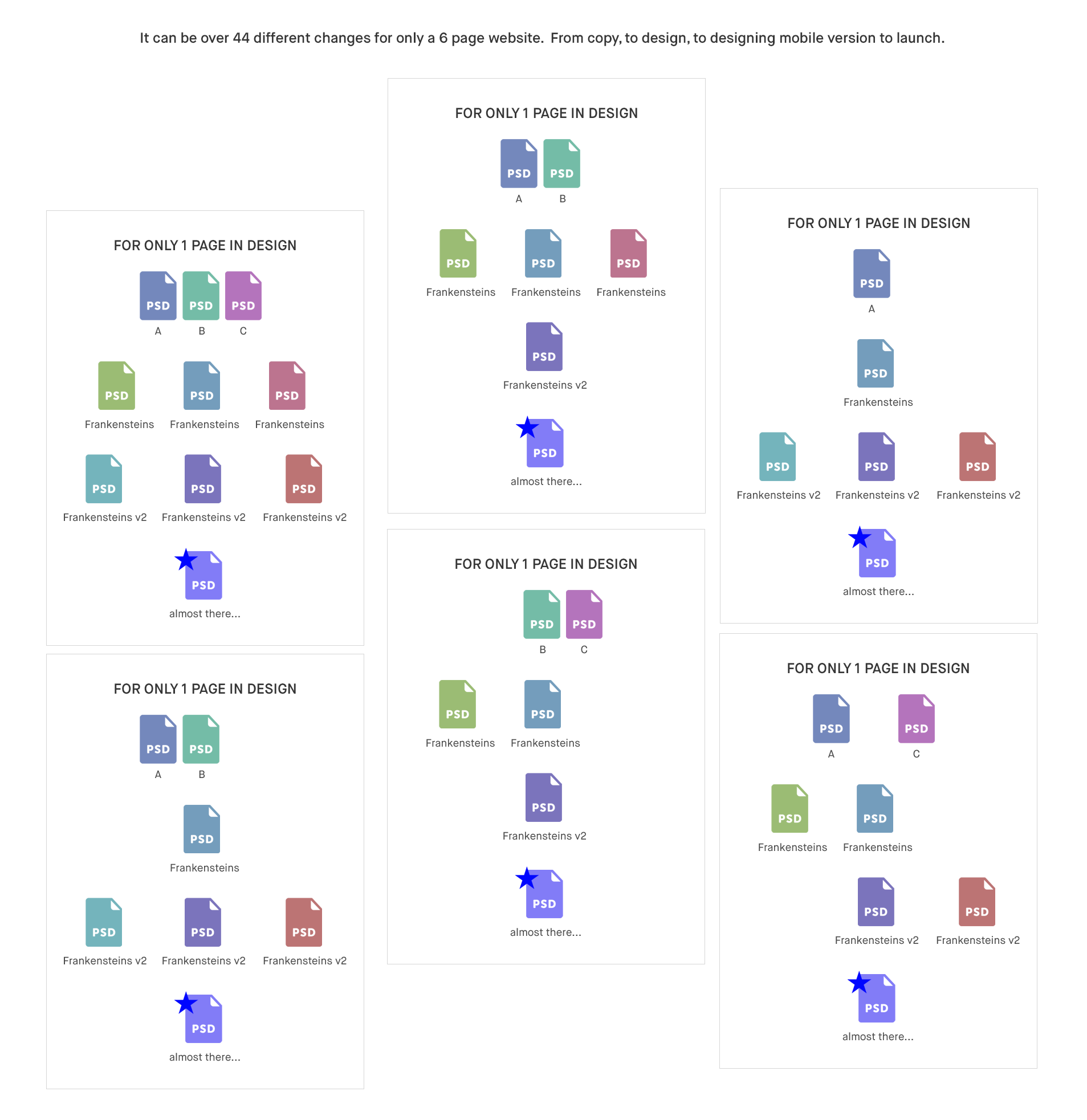
Create three options of look and feel. Build the design system behind all of these components.
-
Client may not select any of them, they want to mix and match parts from one and create their own Frankenstein.
-
Without considering that each design has its own design system, clients selects a design direction that “feels right” to them.
-
Another round of revisions, what does the client feel today? Has it changed from the last iteration or it’s something different? How’s the weather today? any mood swings? (`Δ´)!
-
Create more and more mocks until we can torpedo them through the finish line.
This is where you enter hell with endless iterations.

Style Tile or Style Prototype are two interesting takes on how initial designs could be presented to solicit a sense of feel of the design.
Style Tiles & Elemental Collage
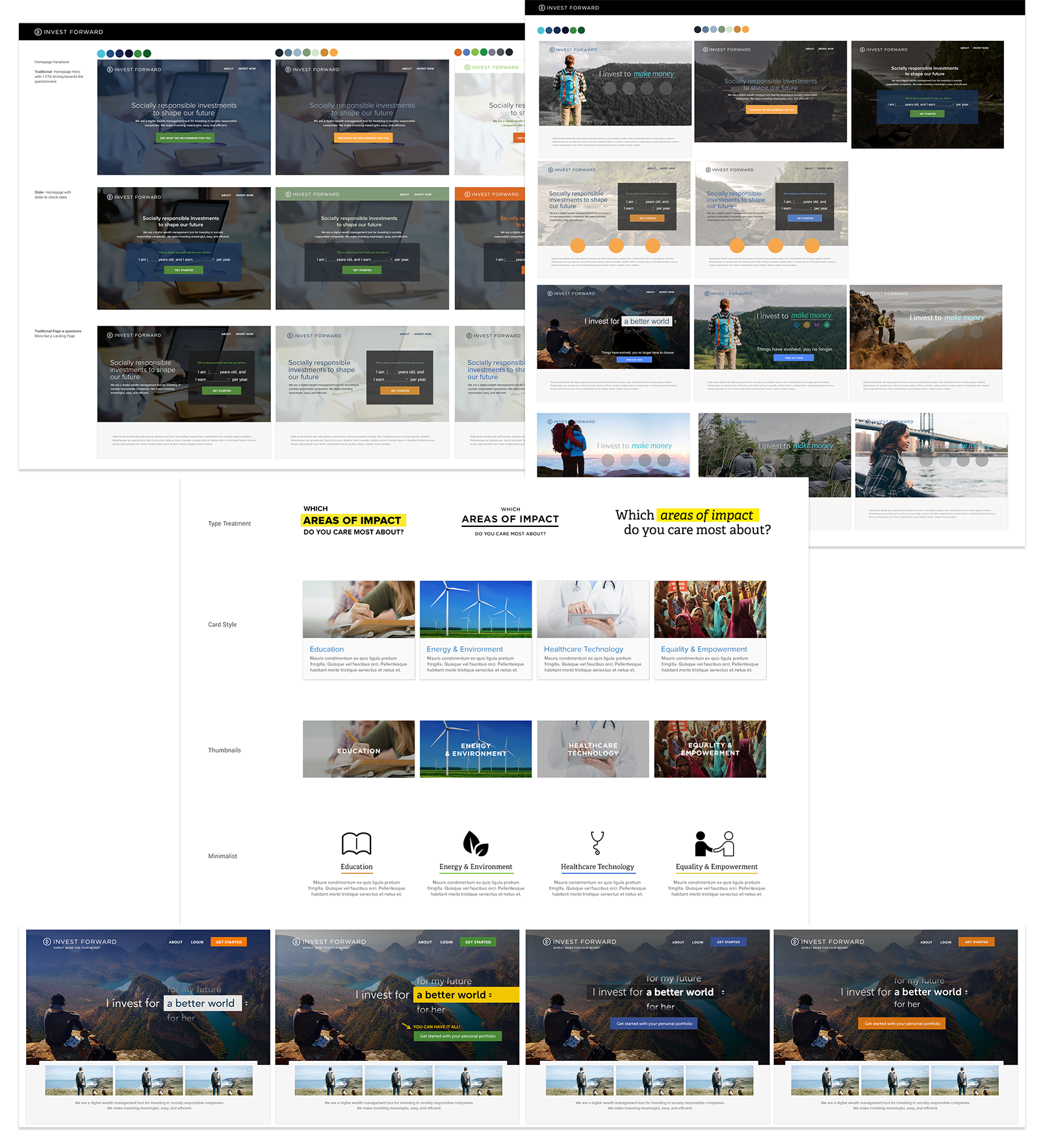
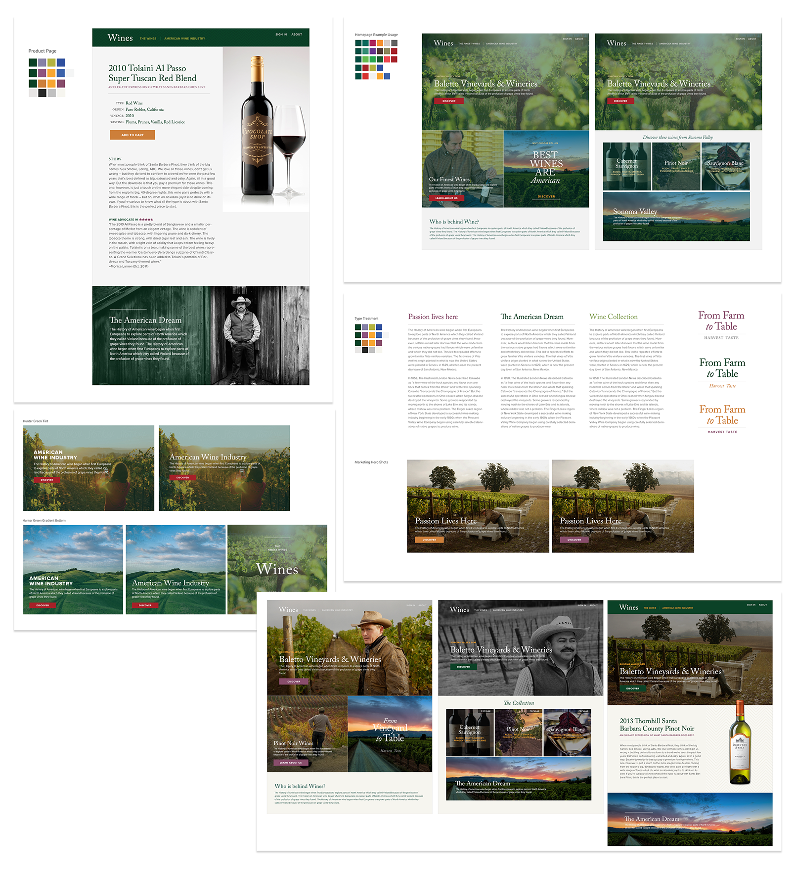
Defining a design system rather than designing pages right from the start. Present client with interface choices without making the investment in multiple photoshop mockups. They are small snippets of deliverables that contain color, fonts, and small elements that are the essence of a visual brand.
Style tiles are a catalyst for discussion around the preference and goals of the project, it is the middle point between a mood board and a mockup.

Prequalify and get a sense of what the client is looking for by asking for samples of different varying websites that can convey the same level of style and need.
I have implemented this new method with a few projects and have success with saving time and getting right to the nitty-gritty of delighting the client with what they want.

Style Tile and Elemental Library Exploration of an Investment Startup. www.investforward.com

Style Tile and Elemental Library Exploration of a Wine Startup
Style Prototype
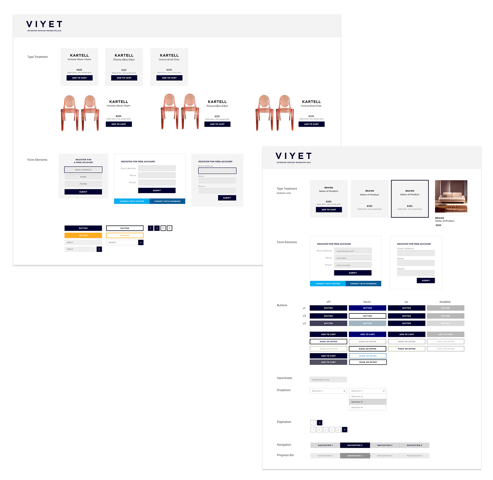
Let a client see a visual summary of a site’s proposed design direction without photoshop images or a functional website. It’s a HTML page that contains typography, button style, colors, rollovers and everything that is needed to establish a direction.

A visual library exploration around UI elements made for developers. www.viyet.com
The Heavy Lifting = Sell Your Ideas
Conveying feeling and brand direction across a few images and typography is a hard feat, it assumes the client is able to stretch their imagination and hone in what they want to see with what they are presented with.
Most of the time when clients are presented with this method, they have a very hard time grasping the details of one style and another. This is when you have to sell your idea and tailor a recommendation with backed design thinking, research, and personal experience. By listening and encompassing the client’s feeling, the design needs to be cohesive with integrated balance and harmony.
I find that this method is not appropriate for every client. Some clients are still unable to visualize the elements without actual concrete designs and the heavily relies on the ability of the designer to sell each distinctive style accurately. There can also be situations where you were unable to educate the client on the design process or the client simply does not want to “be experimental.” Without your ability to sell your ideas and convince your vision, this method could become a wrecking ball in the process.
Expanding the look and feel the library is also a big component of success. Being able to see everything in one place proves to be a great approach to creating cohesive looks. By prequalifying and discovering your client’s feelings and evaluate their “design eye” will allow you to complete your task at a much more productive pace. Guiding the client to the finish line is another great component in launching any design.

No Comments.