Category: Design

  • Design Science or Opinion

    Design Science or Opinion

    In a previous article, I talked about ace-ing the process of design with feelings

    I described how clients should share their feedback by using feelings instead of dictating the visual implementation. Being emotional translates to being passionate and confident in the design you put out. It’s natural to feel very attached to your design and quick to jump on the defensive when someone does not see eye-to-eye.

    Questions to ask:
    • What about other people’s perspective? (UX research results)

    • What if this was beautifully designed but functionally it just falls flat?

    • What if this performs well with barebones code? Is design needed?

    • What if you feel strong against a certain design element but your client feels the opposite? At what point do we give up our own gut instincts and let the other party have it?

    • How many rules do we work within before we realize that there are too many rules? Is being confined inside challenges always a good thing? Is it great to have as many rules as possible?

    Making design be a matter of science and less of a visual opinion.

    Some companies have a lot of financial resources to run tests throughout their entire network. They can say that this shade of green outperforms another shade of green. Making design be a matter of science and less of a visual aesthetic. Being extremely data driven in the design process means that even a 0.0001% better means it’s better. As designers, we could be told that only use this shade of green. Or even test circles against squares and if the square wins, that’s the ‘right’ design.

    Is this design at all?

    While I agree that design should be tested for effectiveness and function, it’s hard to design something when every element is judged by effectiveness by data results. Testing elements can improve current optimizations only in the short term. Not many people are measuring the impact it has on brand affinity and recognition. You can always argue that a young brand doesn’t have brand recognition yet, so during this ‘experimental phase’ we should be able to try as many designs as possible until we “get it right.”

    To be the darling of the startup world, the website design must stand out from ther startup’s and show the growth hockey stick. Design risks must be taken to show this has the special sauce. Taking risks in creating new design does not necessarily mean that a shade of green that appeals to most people would guarantee its success.

    With every short-term experiment, I am always skeptical of it’s accuracy. Most people test for less than a month and call it a day. Should a test that ran for a week to a small selected group of visitors be an accurate indication of effectiveness?

    I’ve worked with a client that ran their “A/B” email test for a week and said that an email with over 8 buttons are more effective because it has a higher click-through rate than one with only three. This email also has 4 banner ads and multi-color call to action buttons which makes it look like an explosion of a mailer catalog. They don’t care too much about their brand affinity and sticking to their selected styling because they care more about conversion.

    Creating a properly curated design test requires a longer, more thorough, comprehensive look at how the user behavior has changed over time. This approach goes against the lean startup mentality where the focus is on shipping fast and failing hard. Speed in design iterations is viewed as effective ways to improve UX/UI design and puts branding in the back seat, but never considering any mid to long-term impact.

    No design is perfect.

    Don’t be too attached, don’t be too emotional about your work. Every design can be improved in the next round. We can only target who we want our users to be, but requires good user research to determine who our real users are and how they behave.

    What is the right balance between data-driven design vs. design creativity? I don’t have the right answer to that, as each has its own set of challenges. It’s an important compass for the designer to consider before signing up for any projects or company, to feel out the direction of your client.

  • Design with feelings and intention

    Design with feelings and intention

    Why do we call initial designs the “Look and Feel?”

    • How do we want clients to give us feedback on initial design concepts?
    • How do we narrow down designs more effectively from the start?
    • Clients should focus on the feeling, not the look.

    What’s a feeling? A feeling is when you are confident in making the best decision by weighing what users care about and the varying points of view involved. The feeling presents itself as a form of balance and harmony. What does this design convey? Does it serve the purpose of the story I want to tell? Is the messaging clear and defined? Is it confusing?

    When you serve clients, you defer all creative decisions to the client. You anticipate what they will say before you present and you quietly root for the work you want them to choose.

    You may have heard this comment, “Do not include a design that you hate because they will choose it!” or “The client just went through twenty iterations and they went back to the first one they saw.”

    Why would a client deliberately choose what seems to be the most boisterously offensively ugly design of them all? Is it because they simply aren’t trained with a design eye and can’t distinguish which design is above the others? How can we change the process of developing feeling towards a design?

    Design has taken a major shift in the past few years, increased attention is paid to mobile responsive sites. The industry shifted from creating table-based layouts to CSS responsive fluid designs. Creating a site that’s table-based means you have to create a design in 1200, 768, 480, and 320. Smaller devices slowly become out of commission and larger density resolution devices become a natural reach in our lives.

    All this is to say that design, annotation, and production graphics has to be made to fit these sizes for the best optimal experience.

    Is there a better way to all of this?

    Let’s take a look at the traditional design process:

    • Initial design work starts with understanding your client’s requirements and desires.

    • Create three options of look and feel. Build the design system behind all of these components.

    • Client may not select any of them, they want to mix and match parts from one and create their own Frankenstein.

    • Without considering that each design has its own design system, clients selects a design direction that “feels right” to them.

    • Another round of revisions, what does the client feel today? Has it changed from the last iteration or it’s something different? How’s the weather today? any mood swings? (`Δ´)!

    • Create more and more mocks until we can torpedo them through the finish line.

    This is where you enter hell with endless iterations.

    Style Tile or Style Prototype are two interesting takes on how initial designs could be presented to solicit a sense of feel of the design.

    Style Tiles & Elemental Collage

    Defining a design system rather than designing pages right from the start. Present client with interface choices without making the investment in multiple photoshop mockups. They are small snippets of deliverables that contain color, fonts, and small elements that are the essence of a visual brand.

    Style tiles are a catalyst for discussion around the preference and goals of the project, it is the middle point between a mood board and a mockup.

    Prequalify and get a sense of what the client is looking for by asking for samples of different varying websites that can convey the same level of style and need.

    I have implemented this new method with a few projects and have success with saving time and getting right to the nitty-gritty of delighting the client with what they want.

    Style Tile and Elemental Library Exploration of an Investment Startup. www.investforward.com

    Style Tile and Elemental Library Exploration of a Wine Startup

    Style Prototype

    Let a client see a visual summary of a site’s proposed design direction without photoshop images or a functional website. It’s a HTML page that contains typography, button style, colors, rollovers and everything that is needed to establish a direction.

    A visual library exploration around UI elements made for developers. www.viyet.com

    The Heavy Lifting = Sell Your Ideas

    Conveying feeling and brand direction across a few images and typography is a hard feat, it assumes the client is able to stretch their imagination and hone in what they want to see with what they are presented with.

    Most of the time when clients are presented with this method, they have a very hard time grasping the details of one style and another. This is when you have to sell your idea and tailor a recommendation with backed design thinking, research, and personal experience. By listening and encompassing the client’s feeling, the design needs to be cohesive with integrated balance and harmony.

    I find that this method is not appropriate for every client. Some clients are still unable to visualize the elements without actual concrete designs and the heavily relies on the ability of the designer to sell each distinctive style accurately. There can also be situations where you were unable to educate the client on the design process or the client simply does not want to “be experimental.” Without your ability to sell your ideas and convince your vision, this method could become a wrecking ball in the process.

    Expanding the look and feel the library is also a big component of success. Being able to see everything in one place proves to be a great approach to creating cohesive looks. By prequalifying and discovering your client’s feelings and evaluate their “design eye” will allow you to complete your task at a much more productive pace. Guiding the client to the finish line is another great component in launching any design.

    Read more about Style Tiles, Visual Inventory, and Style Prototype:

    1. https://alistapart.com/article/style-tiles-and-how-they-work

    2. http://v3.danielmall.com/articles/visual-inventory/

    3. https://www.amazon.com/Sprint-Solve-Problems-Test-Ideas/

  • Developing Style

    Developing Style

    Take inspiration from places outside your comfort zone is where you’ll find new beginnings.

    One of the ways to improve your style, taste, and design is by exploring different methods and approaches that are unknown to you. The design could be generalized into two major components: Creative Direction and Technical Execution.

    A person can be very versed and technically skilled at executing a vision to perfection, but may not be the person that’s directing the concept. Similarly, a strong artist may not have the skills to visually or tangibly create the work. How do we converge these two skill points?

    Styling and Creative Direction
    How do you quantify taste and decipher whose opinions should be respected? One way to develop this taste and inspiration is by stepping out of your comfortable medium into something new.

    Observe your environment and surroundings and practice conceptualizing how and why a certain concept or campaign came to be. ie. (I see a billboard of The House of Cards show on Netflix, why did they select this particular headshot of Frank Underwood? There’s a slight reflection of Claire looking into Frank’s car, why is she not in the car but looking from the outside? What was done to the color grading of this photo that makes the feeling suspenseful? How many other angles could this image be shot differently to convey this same emotion?) Practice and train your brain to think creatively about everything you see. Be keen on the way the light shines on something, or even focusing in on the object of the user’s attention.

    Look deeply behind the scenes and allow yourself to step into the shoes of a director and imagine their vision. Why did they choose this medium? What is the message they want to convey? Was it successful in conveying that message?

    It’s easy for designers to get caught up in what’s “trendy and cool” and ignoring the principles of good design. What makes a style or design classic and timeless? It is made by people who strive to create something unique and have a strong sense that their vision is the right one, no matter what others say. To create something timeless, think outside the box, let go of control and invest in people that shape your work.

    Technical Craft
    To improve your technical craft, it’s an easy solution: work on it until you are extraordinary. Malcolm Gladwell’s theories that it takes 10,000 hours of practice to become an expert, or it takes a huge investment of time in order to be made manifest. It’s also an important point that that is how you can develop your technical skill set, and it’s not based on the innate talent that is assumed beyond ‘training’.

    Being a digital designer, it’s not often I get to hold a piece that I create. There’s something nice to make something with your own hands from typesetting, painting or even simply folding a simple origami. I miss the ability to be tactile. In the digital space, building an app or seeing your work on the internet can feel intangible and I yearn for the nostalgia of holding and presenting physical work.

    Select your poison
    Pick a medium you want to work in. Go back to your roots and make something. Step outside of what you do on the daily and re-energize an old craft. If you don’t have a medium that you can look back on, why not start a new medium? Try and paint a picture every week or take a photo with a DSLR? whatever makes you feel fancy.

    My relationship with the Camera
    As a child, my father used me as the subject of his many photographs. He used a 35mm film camera because a digital camera didn’t exist. He would teach me about lighting, aperture, focus, rule of thirds, shutter speed and what makes a good picture and what doesn’t.

    It wasn’t until about 3 years ago, I bought my first DSLR. I was driven by the memory of the connection I had with the camera and my father. I also thought by self-teaching myself photography would improve my design.

    By no means am I an expert at photography. I solicited my coworkers to let me to take their portrait. I promised them free Linkedin profile photos or photos for their OkCupid. I would venture out on the weekends to photograph people for free and spend countless hours on post-production. I spent a few weeks investing time in taking photos of New York landscapes and I learned everything by trying. I would take a photo, ask for feedback, and self-evaluate the shot.

    I did not expect photography would make as huge of an impact as it has on my life.

    Being a timid and not too adventurous person, the camera changed me. After seeing a photo of The Subway in Arizona, I wanted to go after this image. The path of all resistance dwindled in my mind. My head was filled with wonder and ignorantly dismissed my usual complaints of outdoor activities.

    The subway is a ten-hour hike through the back country of Arizona. I am not sure what I was thinking as I have never walked ten hours in my life. Every step up and down the canyon felt like my heart was going to come out of my fat city-lazy body. I ignored the wet slippery sand beneath my heels and the pain of my bruised toenails from navigating through sharp and steep rocks.

    Chasing the image infested my mind. I would have never been able to do this today, feeling accomplished and grateful that I’ve done something completely out of my comfort zone.

    Pushing yourself beyond your personal limit is very scary. How do you know what your limit is if you never come close?

    My dad said this to me when I left home for New York. 
    “Success is all in your mind. Some people need to climb Mt. Everest to feel accomplished. For me, if I can hike a local mountain, I’m just as successful as a Mt Everest climber. You do not need to compete with them, just compete with yourself.”

  • A Faster Way To Respond To Messages

    A Faster Way To Respond To Messages

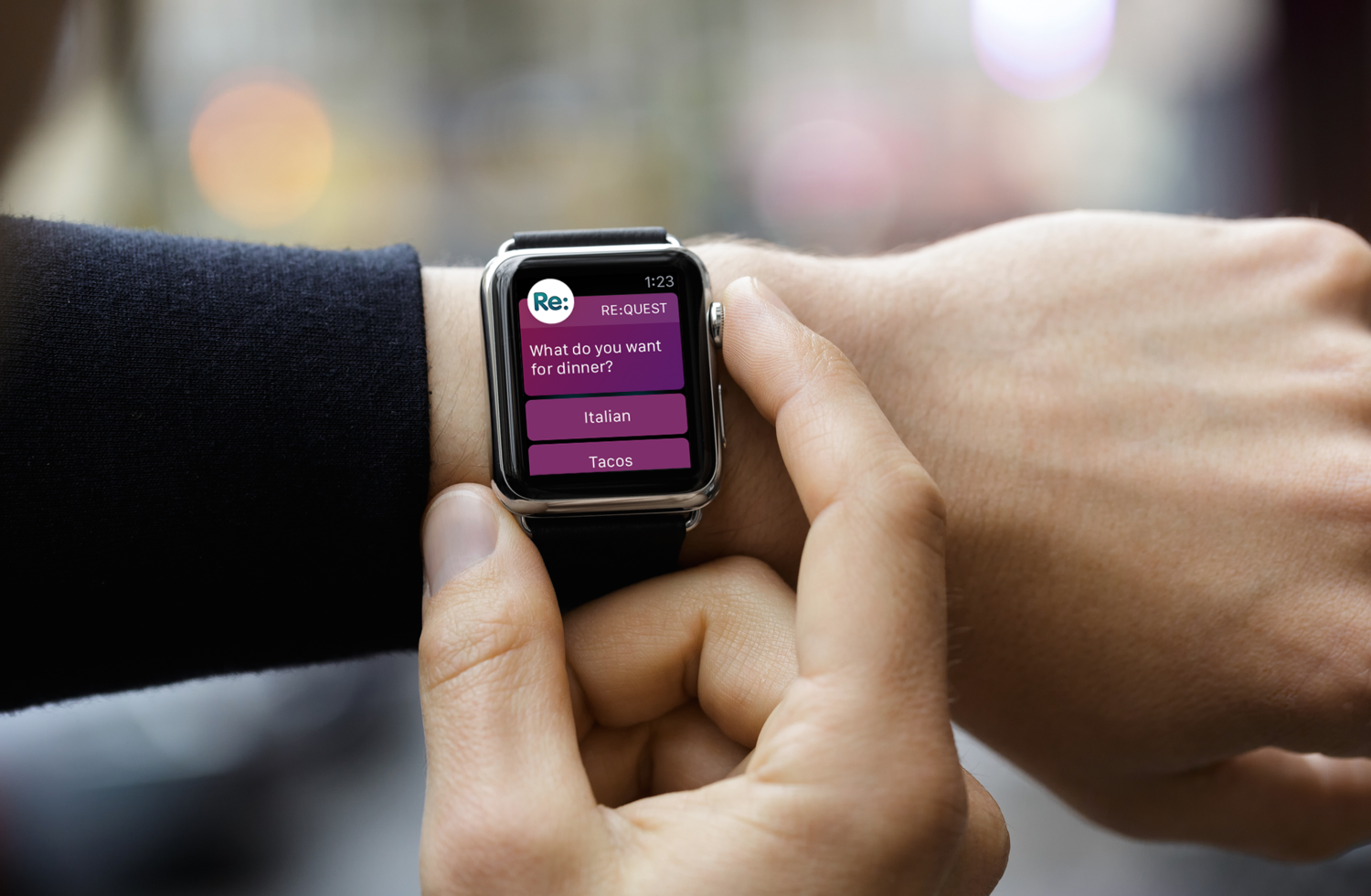
    This is a new app I’ve been designing over at MartianCraft, called Re:quest. Send questions from your iPhone to a friend’s Apple Watch for fast, and easy answers. Write questions with your voice using only syntax via your watch, so you never have to pull out your phone to ask someone a simple question. Check it out and download it for free. It was also featured here on Techcrunch.

  • Kartell Bourgie Lamp

    Kartell Bourgie Lamp

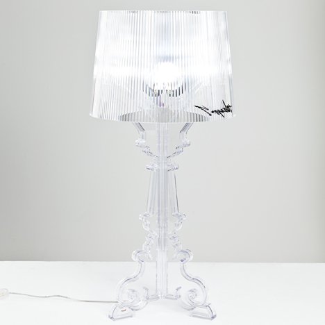
    Kartell Bourgie have been on my mind for the last six years. Ever since I saw a photo of this lamp, I knew I wanted it. The price point for this acrylic lamp is sort of steep, so I never had the courage to buy it. This weekend in NYC was the perfect awakening. I had just recently purchased a new iMac and I wanted to do a bit of decluttering to start my workspace right.

    I wanted to keep it very clean and minimal. You can’t see in this photo, but I’ve brushed all my small nit-nacks onto the table behind me. The lamp is really a statement piece. It comes in a variety of styles, matte white/black, or shiny metallics. I wanted wanted this in clear, so it can look nice and simple. 

    My NYC apartment is quite small, and having more glass surfaces can make the room feel a lot bigger. I’m extremely satisfied with this lamp, and happy that I finally got it. 🙂

  • Turning 30, one second at a time

    Turning 30, one second at a time

    Turning 30, one second at a time from Cat Lo on Vimeo.

    On Feb 1 2013, I was determined to make my last year of my 20s the best year of my life by living to the fullest, embracing the now, and following wherever my heart takes me.

    It was a great experience documenting a second a day for 365 days. This gave me a whole new perspective on how to approach the first year of my 30’s with greater love, appreciation, and gratitude for everything I have in my life.

    Filmed with: iPhone in New York City
    Music by: Daniel Kim – Pop Danthology 2012
    Cesar Kuriyama’s 1 Second Everyday


    Notables by Month:

    • February 9 – Wearing Marvel Lizard mask to terrorize kids at Toys R’Us

    • March 26 – Gizmodo posted my Linkedin design on their site

    • March 29 – Made my first Draw My Life Video

    • April 22 – First time firing someone at my job. I had to google for tips.

    • May 23 – Blu refuses to do Cat beard http://cat-beard.com

    • June 8 – First date with my bf

    • June 29 – SO SPARKLY

    • July 8 – LA Santa Monica Pier

    • July 27 – BF changed his fb update. Not official til its fb official. LOL

    • Aug 1 – First time ever stepping into Queens

    • Aug 20 – VaynerMedia Brooklyn Hot Dog spandex wearing delivery man http://wunwun.com

    • Aug 30 – Someone was bandsaw-ing coconuts

    • Oct 12 – Carved my first pumpkin

    • Nov 02 – Blu’s buddah style

    • Nov 21 – Walking with Zombies on way home

    • Nov 30 – Crazy Birthday Candle on a cake I made

    • Dec 11 – Jelly at Monterey Bay

    • Jan 11 – Ivan ramen, so good

    • Jan 31 – Anti-Semitic Elmo from Times Square wasn’t in at work

    • Feb 1 – Turned 30!